UX Project: Ramen Tatsu-Ya app
We’re creating a new Ramen Tatsu-Ya app to help people make a reservation and pre-order their food and drinks.
The product
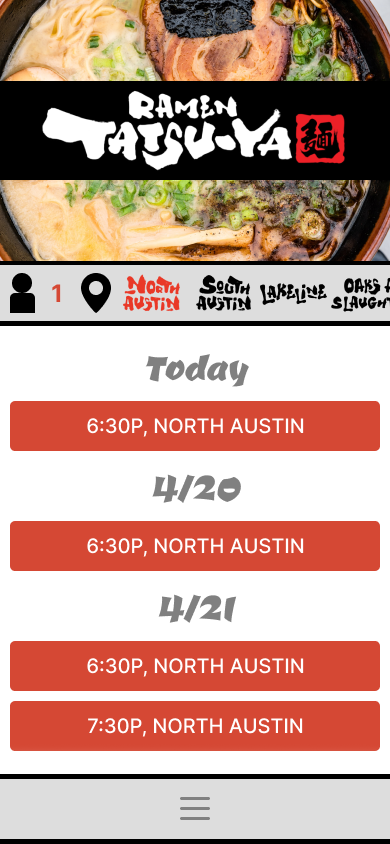


Project duration
February 2023 - April 2023
Project overview
Currently Ramen Tatsu-Ya does not offer reservations to their restaurants. A visit to Ramen Tatsu-a typically includes a long wait to get in.
The problem
Allow users to make reservations, check in, order and check out from the app; bypassing long wait times.
The goal
My role
Lead UX designer, UX researcher
User research, wireframing, prototyping, design
Responsibilities
User research
While conducting user research, it became apparent that the existing Ramen Tatsu-Ya app works well for what it is trying to achieve.
However, the lack of a reservation system provides a great opportunity to provide a new aspect of service that will reward regular customers while making minimal impact on existing wait times.
Summary
User research: pain points
Wants favorite food, but can’t wait in line
Would really like to eat at Ramen Tatsu-Ya, but doesn’t have time or ability to wait in line for a long time. A reservation system can make this possible.
Making a reservation can be hard
Our app will make the process of making a reservation easy for users.
Ordering food can be challenging
Some food-ordering apps can be challenging to use. Our app will be simple and intuitive.
Not confident in ordering
Our app will leave users feeling confident in their ordering.
Persona: Lois
Lois is a busy executive with a family who needs a quick and easy way to make a reservation at Ramen Tatsu-Ya and order ahead so they can enjoy their favorite meal even though they don’t have time to wait in line.
Problem statement

Age: 33
Education: UCLA
Hometown: Tuscon, AZ
Family: Married, 2 children, 1 dog
Occupation: Marketing Executive
“I wish I could eat at Ramen Tatsu-Ya all the time, but I just don’t have time to wait in line.”
Be able to make a reservation with their favorite restaurant
Be able to order ahead so they can enjoy their favorite meal quickly and easily
Goals
Waiting in line takes too much time
Wants their favorite meal
Frustrations
Lois is very busy with their high-pressure job and their young family. She loves Ramen Tatsu-Ya and would love to enjoy it more often, but long lines prevent them from considering it. Lois would most like a way to make a reservation and order ahead quickly and easily.
The goal was to make the reservation process as simple and easy to use as possible.
Ideation


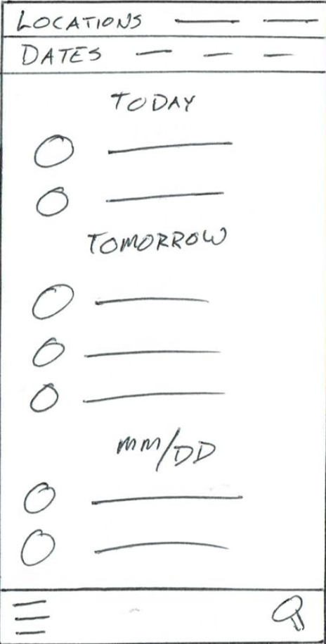


Starting the design
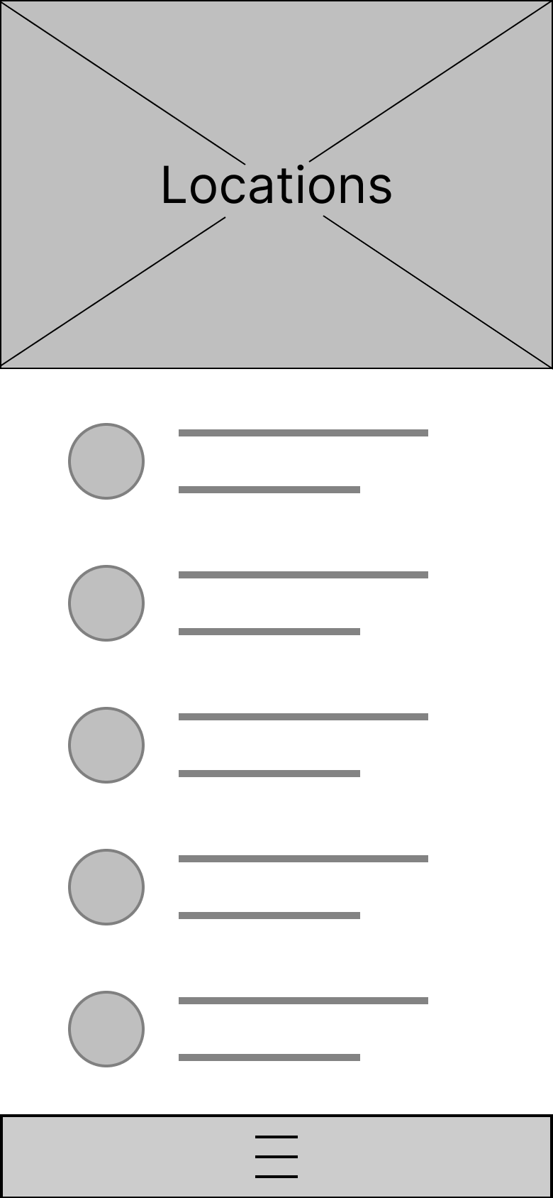
The location bar makes it very easy to see multiple locations.
Digital wireframes
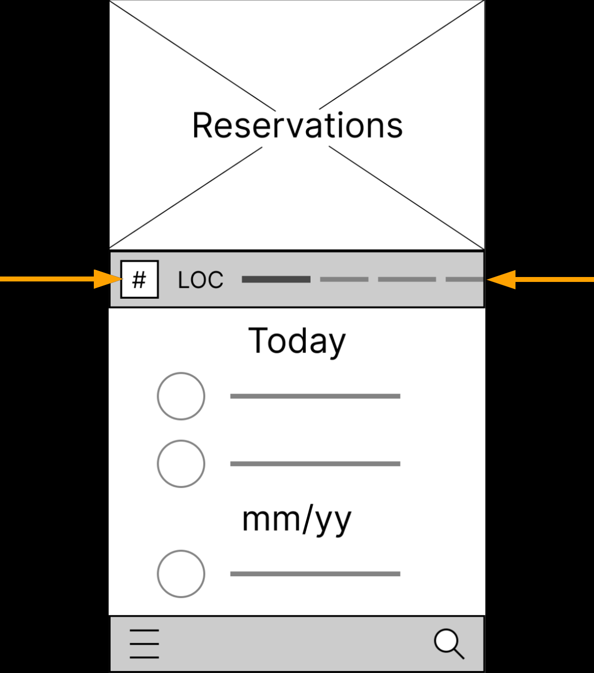
Quickly select the number of guests in the party
Easily sort through various locations
Starting the design
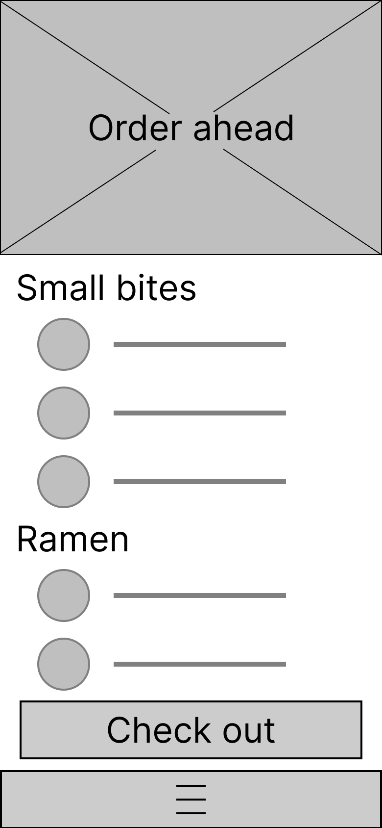
Easily view and select food items.
Easy access to bottom-docked menu button.
Digital wireframes
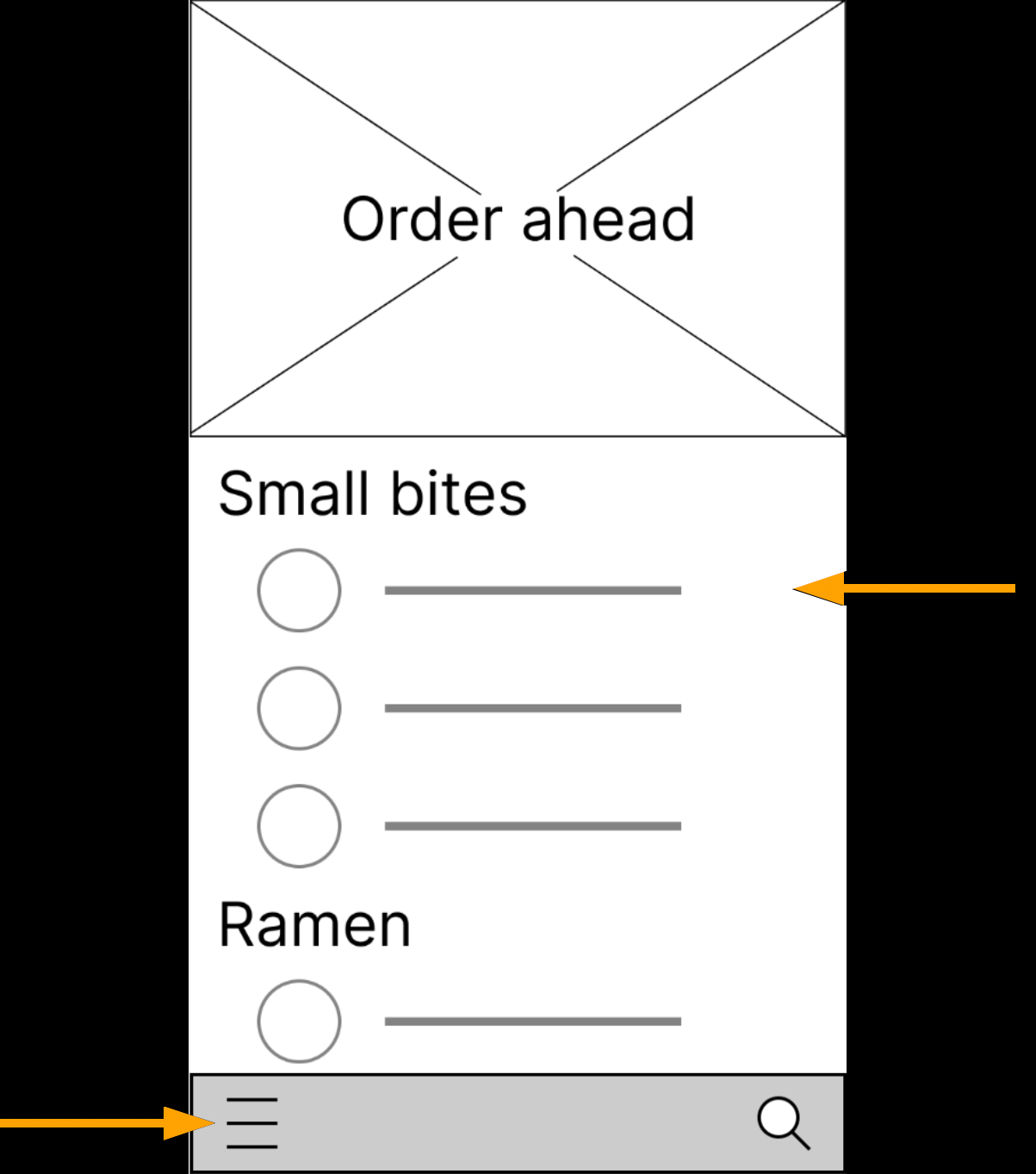
Easy menu access
View and select menu items
The user starts on the Reservations screen. They confirm their reservation. Then place their order and pay ahead of time.
Low-fidelity prototype

Usability study: parameters
Study type:
Unmoderated usability study
Participants:
5 participants
Location:
US, remote
Length:
30-60 minutes
Usability study: findings
Round 1 findings
Pop-up
The pop-up to inform the user was met with annoyance and confusion
Ordering
Some users were unsure their order was correct
Color
In general, most users would have liked more color and visual cues
Round 2 findings
Adding items
Some users were still unsure if an item was added to the cart
Location bar
Some users were confused how the location bar works
Color
Overall, users enjoyed the colors and visual cues
Refining the design
An emphasis was made to make the visual cues better.
Mockups
Before usability study
After usability study


Docking the menu button to the bottom provides the user with consistency.
Mockups
Before usability study
After usability study


Mockups

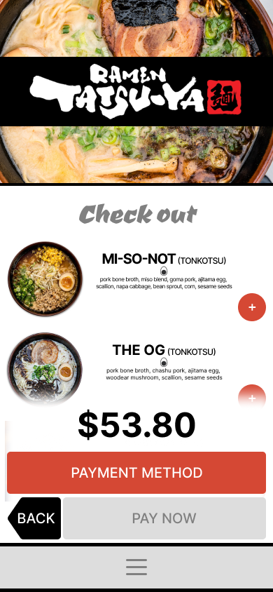


The user starts on the Reservations screen. They confirm their reservation. Then place their order and pay ahead of time.
High-fidelity prototype

Accessibility considerations
The colors were chosen with low-visibility users in mind. We included high-contrast colors and large buttons.
Tested using Assistive Technologies.
Check out page was designed so the user was confident the order was correct.
Going forward
Takeaways
Impact:
This design and concept could be practically applied and increase customer satisfaction and sales.
“I like how straight-forward it is. It feels like it walks you through it.”
What I learned:
In this project I learned the entire process of creating a wireframe and working prototype of an idea that could benefit the world. Pretty cool.
Next steps
There needs to be better feedback to the user when adding items to cart. Will explore a cart button with notification.
May need better feedback or better prototype to illustrate how location bar works.
Will explore expanding prototype to include more elaborate cart feature.
Let’s connect!
Thank you for checking out the Ramen Tatsu-Ya app!
I look forward to any feedback you may have.
Please feel free to contact me through one of the following:
Email: jason.r.nichols@gmail.com
Website: jason-nichols.com
Linkedin: linkedin.com/in/jasonrnichols/
