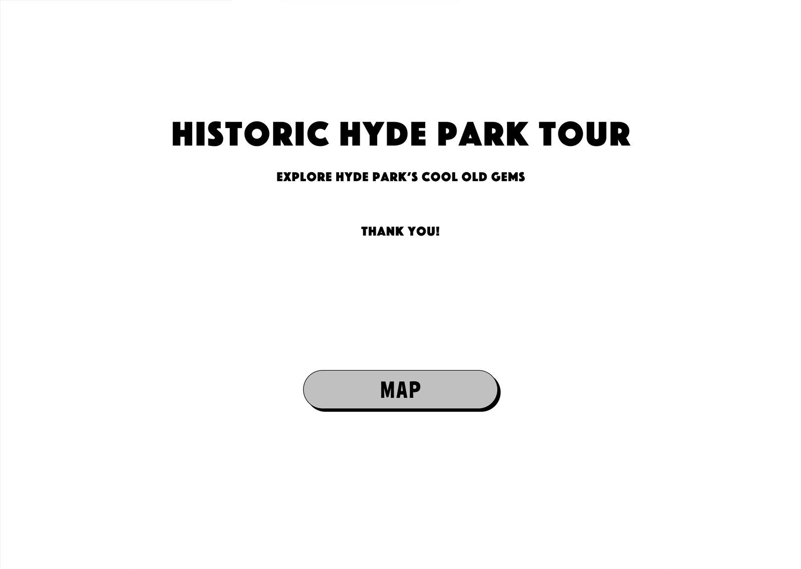
UX Project: Historic Hyde Park Tour

We are creating a responsive website that will showcase many of the vintage cars, homes and businesses in the Hyde Park neighborhood to help those who are curious to find these old gems.
The product

Project duration
April 2023 - May 2023
Project overview
Currently there is not a comprehensive list of vintage vehicles, homes and businesses in Hyde Park.
The problem
Empower the curious to discover many of the vintage things Hyde Park has to offer and encourage new generations to help preserve the past.
The goal
My role
Lead UX designer, UX researcher
User research, wireframing, prototyping, design
Responsibilities
User research
While conducting user research, it was discovered that there was no comprehensive database of the immense number of vintage vehicles, historic homes or businesses that can be found in the Hyde Park neighborhood..
It became apparent that there was an opportunity to create that database and present it as a self-guided tour so that current and future generations could enjoy the icons of the past that grace this wonderful neighborhood.
Summary
Persona: Edith
Edith is a busy trying balance work and family who needs a comprehensive database of old vehicles and homes so that when they go exploring in their neighborhood they can enjoy all the vintage the neighborhood offers.
Problem statement

Age: 52
Education: Sam Houston
Hometown: Houston, TX
Family: Married, 2 children, 1 dog
Occupation: Executive assistant
“I always see really cool old cars, trucks and homes in my neighborhood, but I can never remember where they are when I want to show friends or family.”
Have access to a database of old cars and homes in the neighborhood
Have an app that is easy to understand
Goals
Forgetting where they saw a cool old truck
Apps that are too confusing or just don’t work
Frustrations
Edith has lived in Hyde Park for 13 years and loves seeing vintage vehicles and historic homes. She also likes to support businesses in her area that have been around forever. They could use an app that shows them all the old stuff in their neighborhood so they can explore when they have time.
Starting the design
The goal was to make the interface as simple and easy to use as possible. The site was best configured with a map and a list.
Ideation

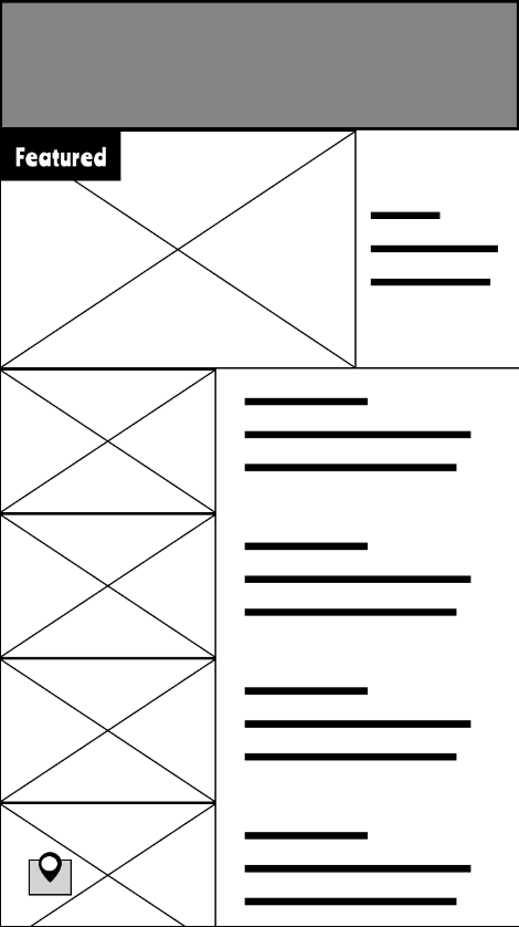
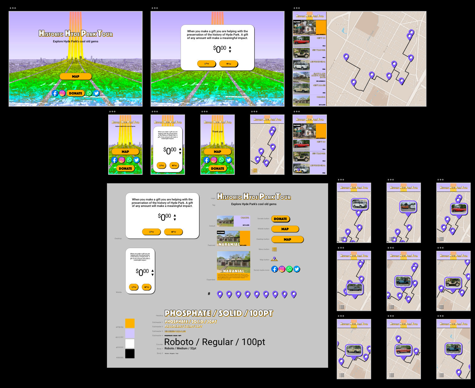
The mobile version would have two separate components: map and list. The desktop version would be able to include both together.


Starting the design
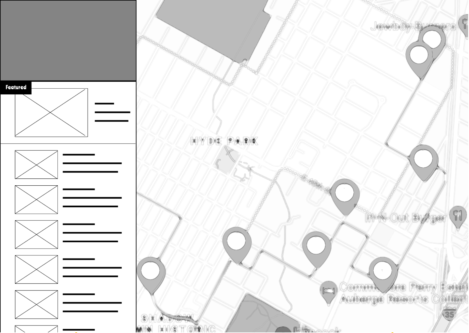
Here you can see how both the map and list are able to fit together comfortably on the desktop version.
Digital wireframes
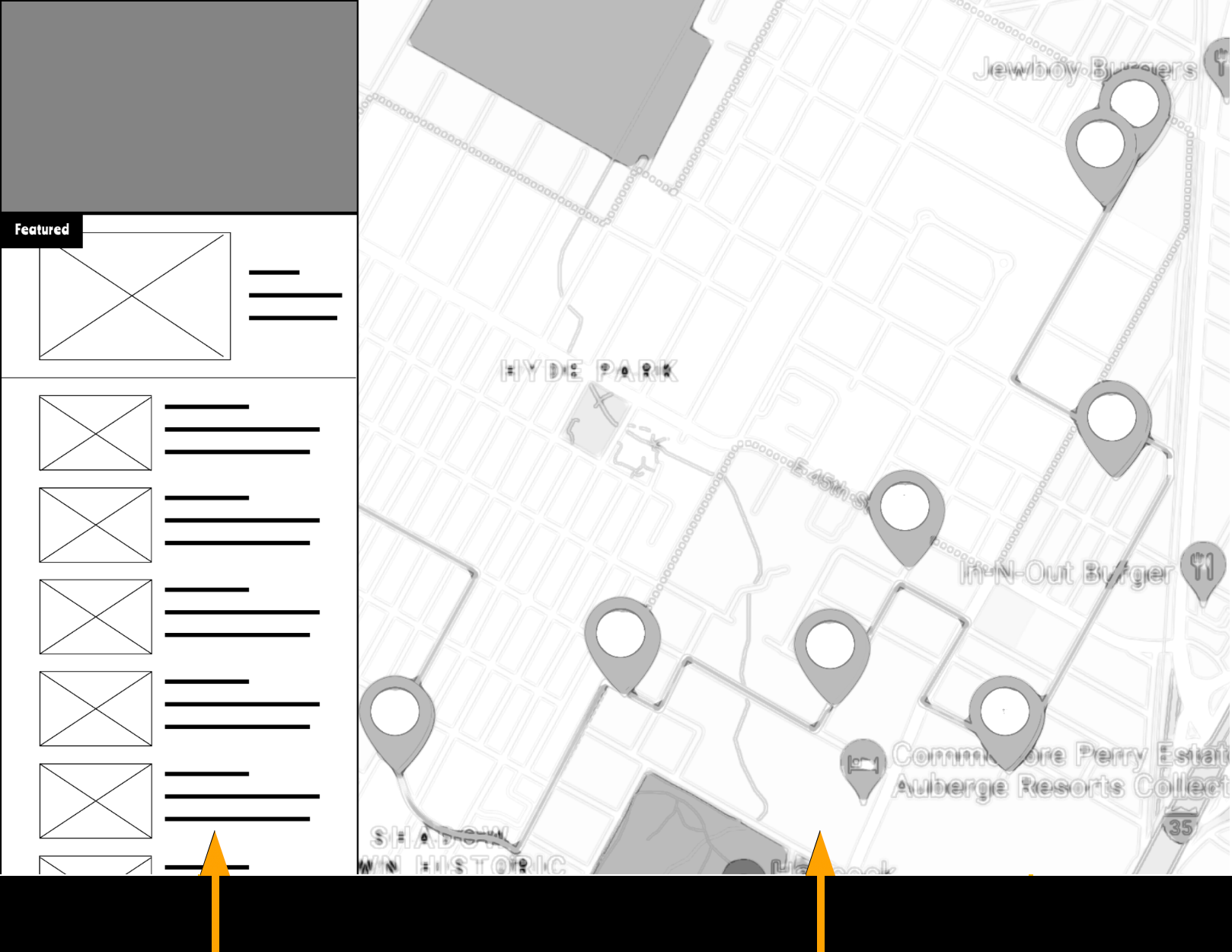
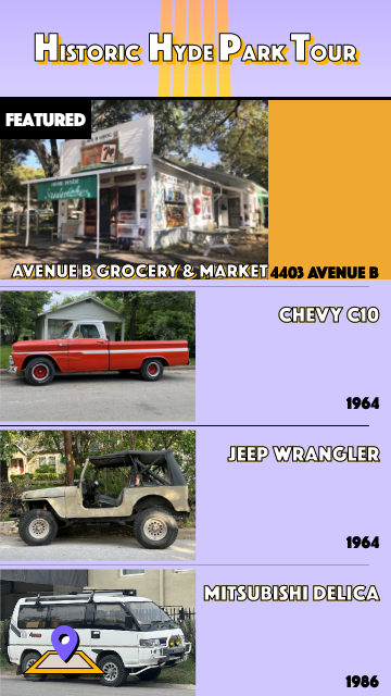
List of items (vehicles, homes, businesses)
Interactive map
Digital wireframe screen size variations
You can see that the mobile version needs to have the list and map as separate pages.
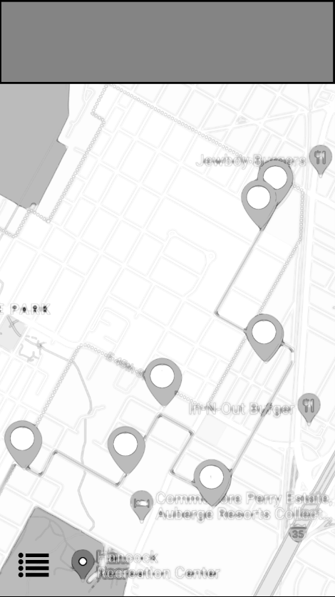

The user starts on the homepage and then is able to view the map and/ or list of entities.
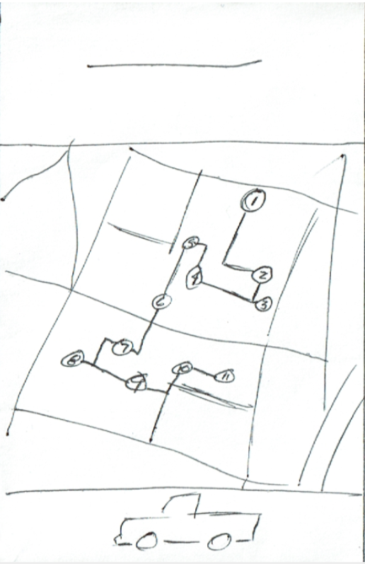
Low-fidelity prototype
Usability study: parameters
Study type:
Unmoderated usability study
Participants:
5 participants
Location:
US, remote
Length:
20-30 minutes
Usability study: findings
Color
It became apparent that strong colors were needed to help the user navigate
Social
To help engage more users it was suggested to include social media links
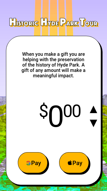
Donate
It was suggested that users should have the option to donate and the funds could be put back into the community
Refining the design
Based on the insights of the usability study, an emphasis was put on colors and contrast. This will aid users in navigating the site.
Mockups

After usability study
Before usability study
After usability study
Before usability study
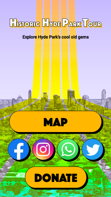
Based on the insights of the usability study, buttons were added to the home page for social media connection as well as for a donate option.
Mockups

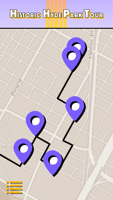
The high-fidelity prototype followed the same user flow as the low-fidelity prototype. A Donation page was also added as well as the other suggestions from the usability study.
High-fidelity prototype
Accessibility considerations
I used simple, high-contrast colors and large font to help users navigate the site.
I used different sized text to create a clear hierarchy.
I used landmarks to help users navigate the site, including those who use assistive technologies.
Responsive design
The two main parts will be the map and the list. These two components will help users discover vintage vehicles, homes and businesses; either by locating on the map or by exploring the comprehensive list.
Sitemap

Going forward
Takeaways
Impact:
Our users indicated that the design was easy to navigate and the visual hierarchy made sense.
What I learned:
I learned the value of keeping a design simple.
Next steps
Retest the updated design and see if it resonates with our users
Explore and ideate more features
Let’s connect!
Thank you for checking out the Historic Hyde Park Tour app!
I look forward to any feedback you may have.
Please feel free to contact me through one of the following:
Email: jason.r.nichols@gmail.com
Website: jason-nichols.com
Linkedin: linkedin.com/in/jasonrnichols/